PROJECT OVERVIEW
Role: Product Designer
Timeline: 6 month
Tool: Figma
ONE STEP CHECK OUT
ONE STEP CHECK OUT
The Challenge
The Challenge
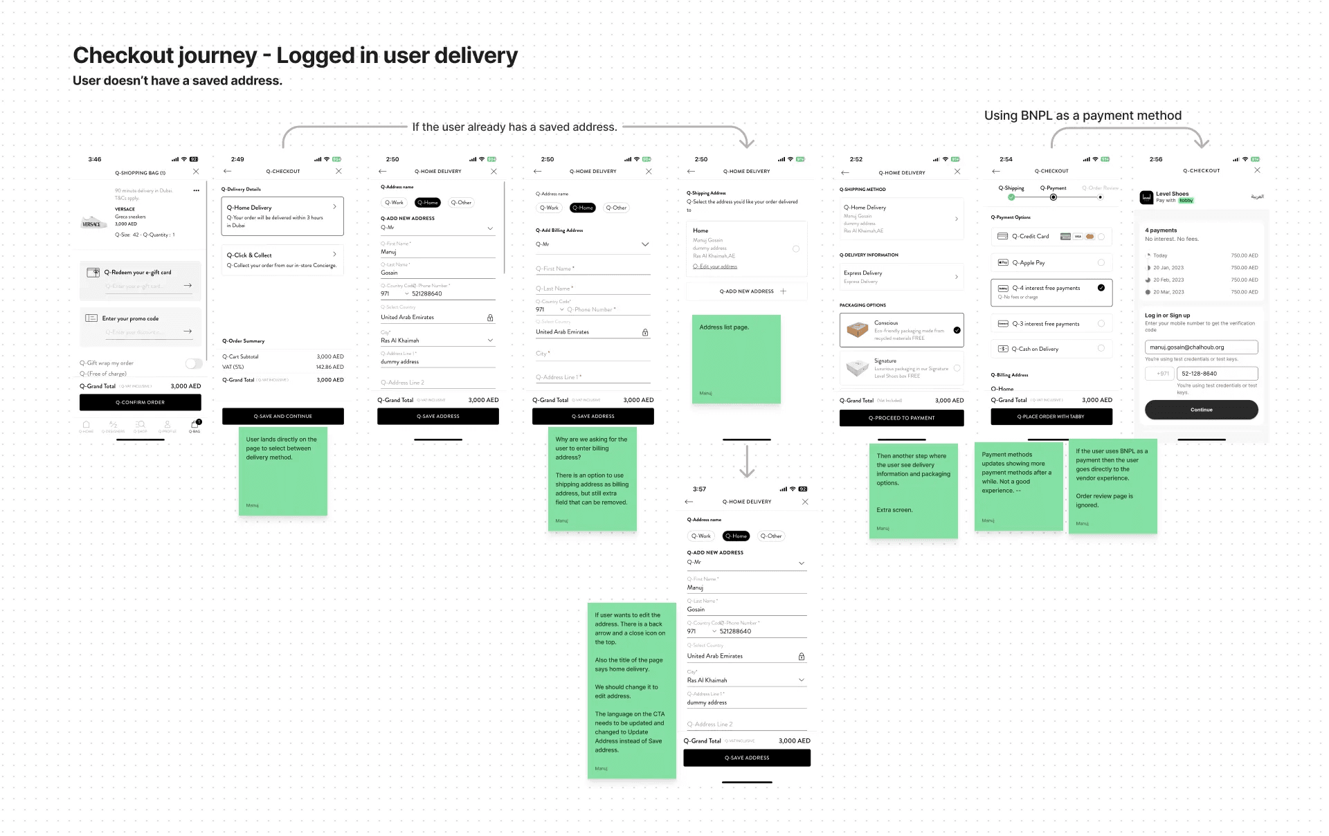
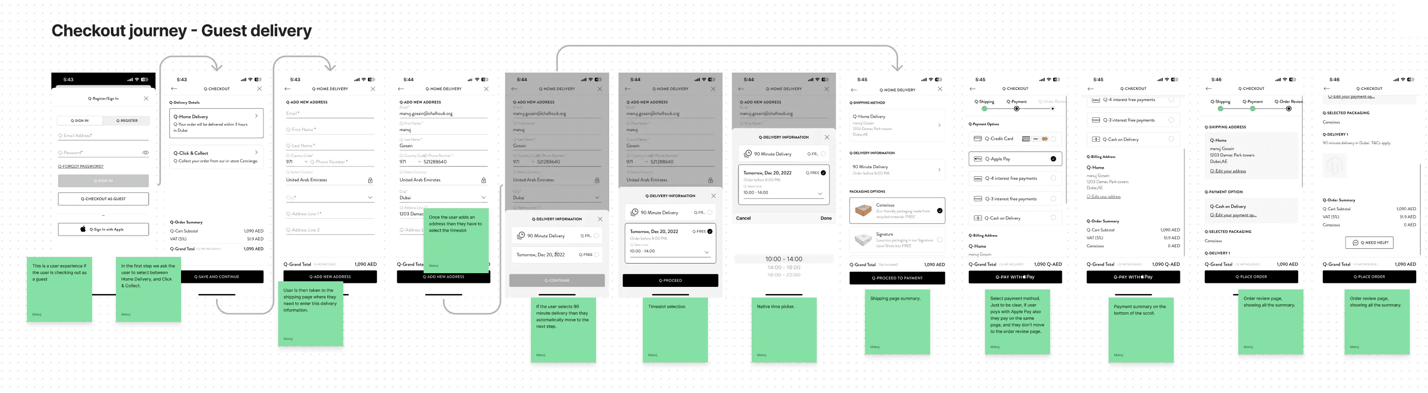
Beginning of the last year we started a very important journey: Revamping the Check out. For an e-commerce business, the checkout experience is where every detail matters. A smooth, transparent, and user-friendly process can make the difference between a sale and a lost customer. In the previous journey, the user needed to complete 7/8 steps before checking out. Many steps can cause decision fatigue, encouraging cart abandonment, and negatively impacting conversion rates.
Beginning of the last year we started a very important journey: Revamping the Check out. For an e-commerce business, the checkout experience is where every detail matters. A smooth, transparent, and user-friendly process can make the difference between a sale and a lost customer. In the previous journey, the user needed to complete 7/8 steps before checking out. Many steps can cause decision fatigue, encouraging cart abandonment, and negatively impacting conversion rates.
Our goal was to:
Simplify the checkout by reducing the number of steps
Improve visual design and content
Explore opportunities for innovation
Increase conversion rate
Reduce cart abandonment
Our goal was to:
Simplify the checkout by reducing the number of steps
Improve visual design and content
Explore opportunities for innovation
Increase conversion rate
Reduce cart abandonment
Research & Discovery
Research & Discovery
We made a very intensive competitor benchmarking including both luxury and mainstream retail in different industries from fast retail to cosmetics.
We made a very intensive competitor benchmarking including both luxury and mainstream retail in different industries from fast retail to cosmetics.
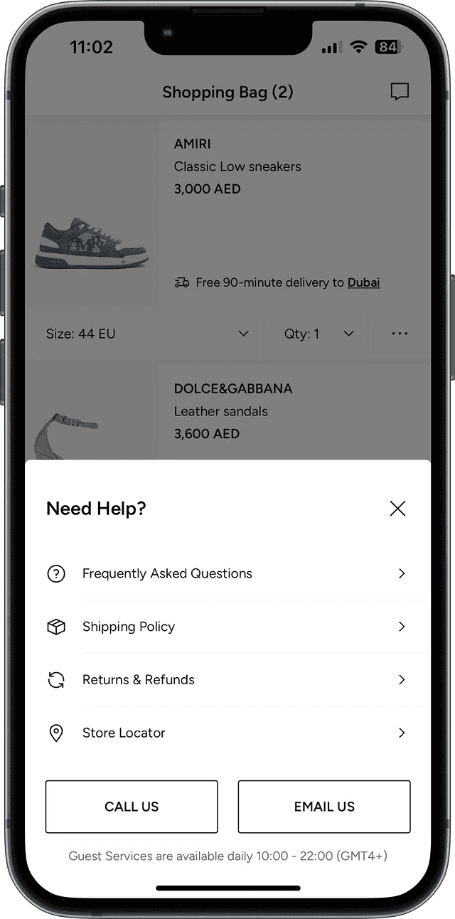
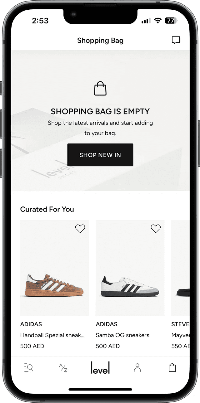
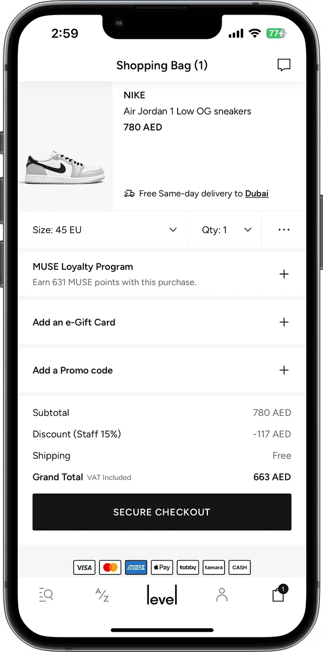
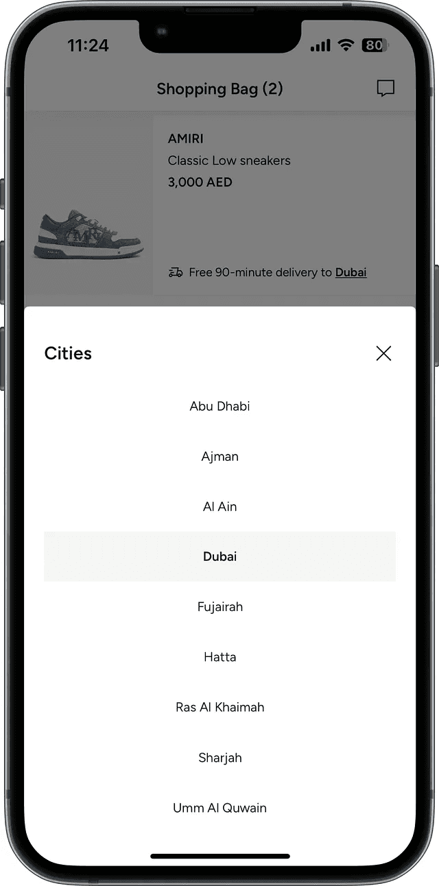
Shopping Cart
Shopping Cart
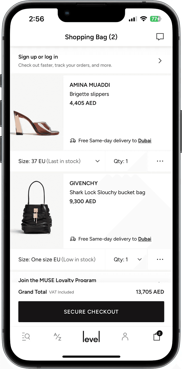
The shopping cart helps you track your selections and stay informed about key details before you checkout. We paid extra attention to:
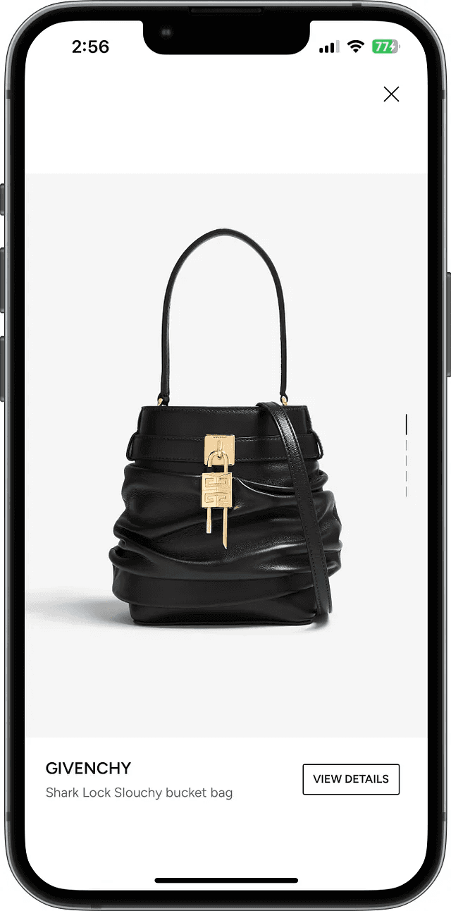
The user should have access to the image gallery to limit cart abandonment.
The user should have access to delivery promises based on their address
The user should be able to edit their sizes and quantity.
The total order value of the item and highlighting shipping cost.
Users should be allowed to move their items to the wishlist rather than deleting
Highlight free returns up to 30 days and display multiple payment options.
If a guest user is shopping, give them the option to sign in or create an account highlighting the benefits.
If a user lands on an empty shopping bag, recommend personalized products based on their browsing behavior.
The shopping cart helps you track your selections and stay informed about key details before you checkout. We paid extra attention to:
The user should have access to the image gallery to limit cart abandonment.
The user should have access to delivery promises based on their address
The user should be able to edit their sizes and quantity.
The total order value of the item and highlighting shipping cost.
Users should be allowed to move their items to the wishlist rather than deleting
Highlight free returns up to 30 days and display multiple payment options.
If a guest user is shopping, give them the option to sign in or create an account highlighting the benefits.
If a user lands on an empty shopping bag, recommend personalized products based on their browsing behavior.
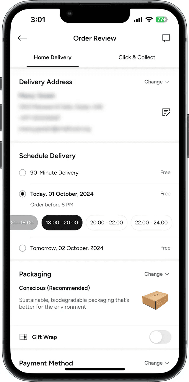
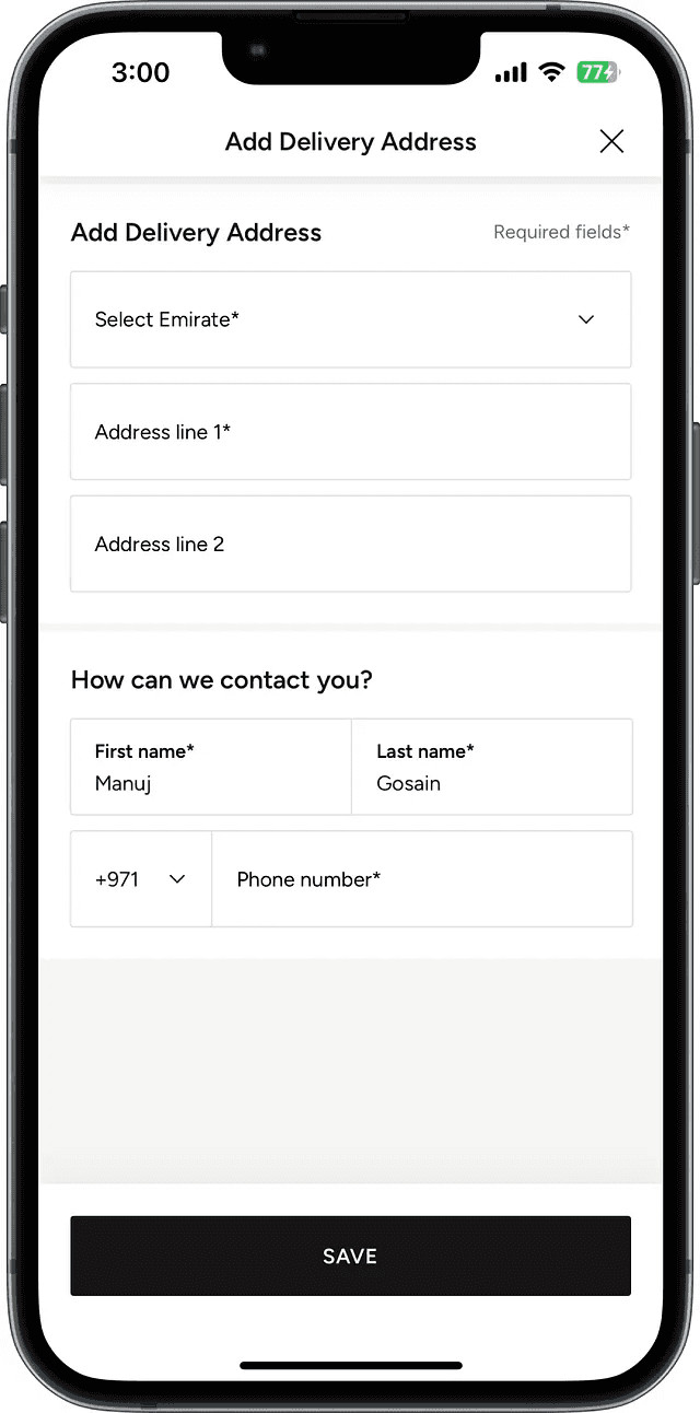
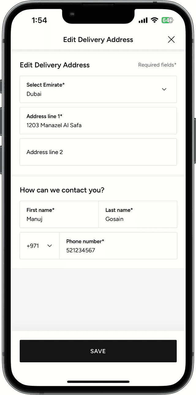
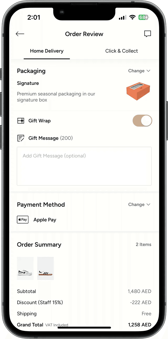
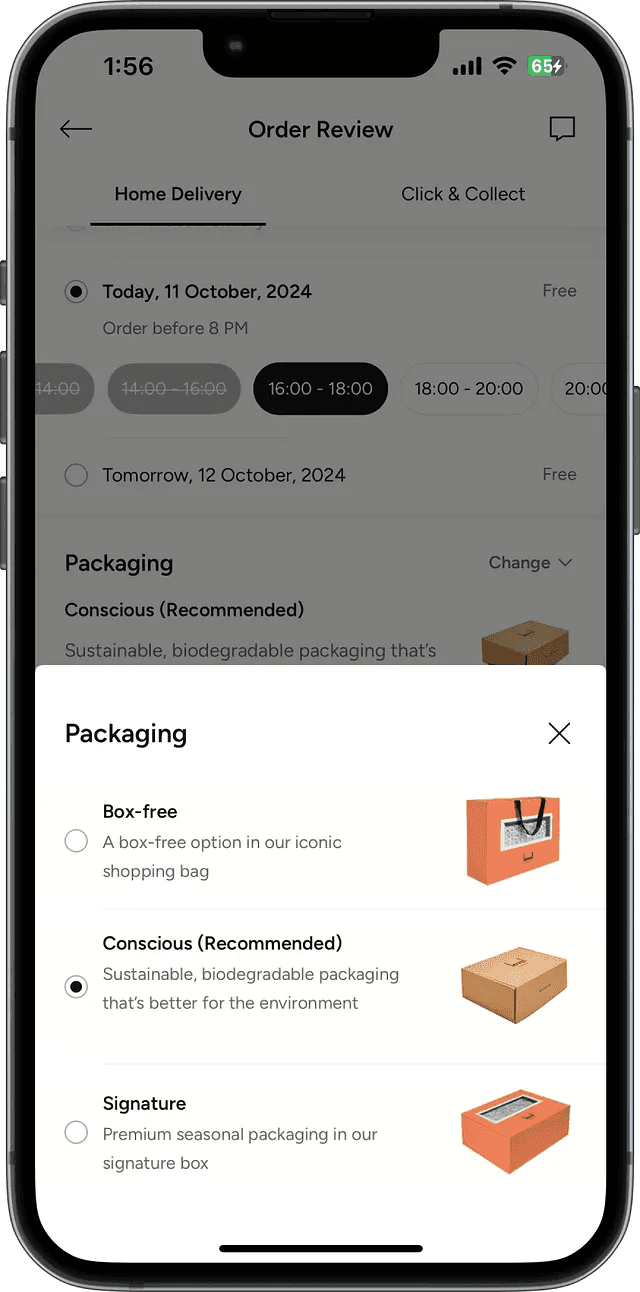
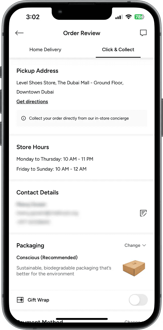
Checkout
Results
Results
This checkout revamp was the most extensive and high-impact project I have worked on, playing a crucial role in shaping the company's e-commerce experience. Given its scope, the development process was long and required multiple iterations, as we continuously refined the design to balance user needs, business goals, and technical constraints. Each phase brought new insights, from addressing unexpected user behaviors to optimizing for performance and scalability.
Through this project, I learned the importance of patience, adaptability, and cross-functional collaboration. Designing for such a critical touchpoint meant constantly evaluating trade-offs between ideal solutions and real-world limitations. While the journey was complex, the outcome significantly improved the checkout flow, reducing friction, increasing conversions, and reinforcing the brand’s commitment to a seamless shopping experience. This experience has strengthened my approach to problem-solving in large-scale design projects, making me more strategic and resilient in the face of challenges.
© 2025 Hilal Oztas